Building Design Systems with v0 and shadcn/ui
Create consistent, reusable component libraries using v0's integration with shadcn/ui.
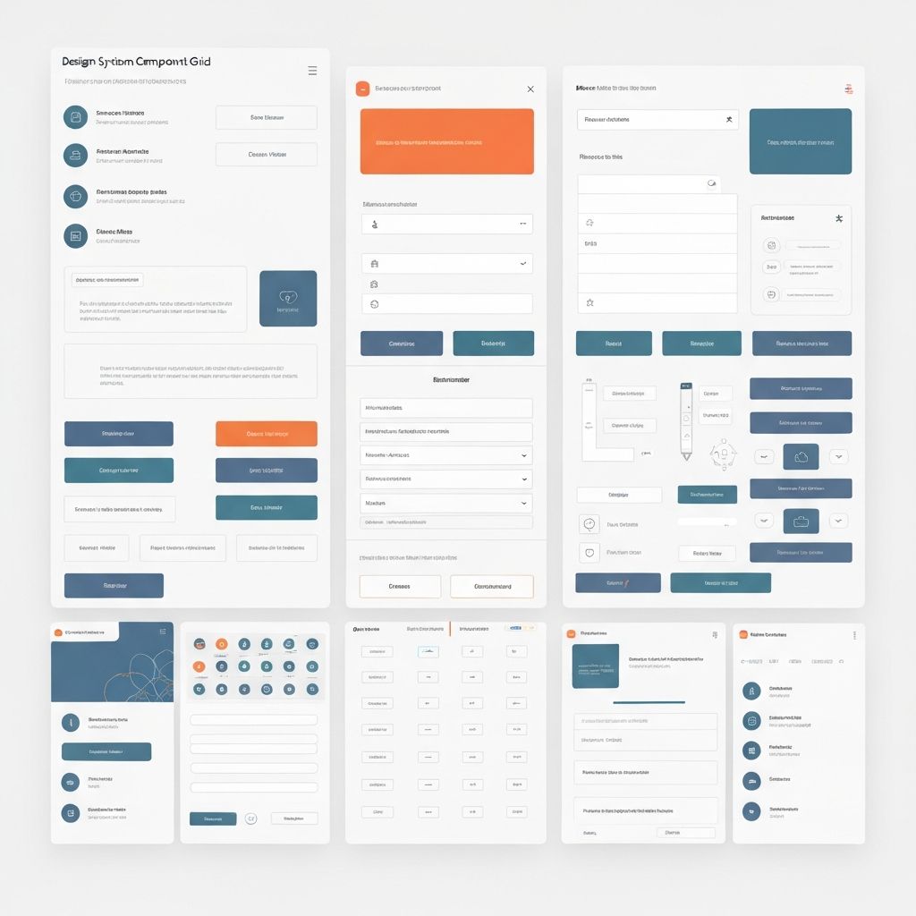
Design systems ensure consistency and speed up development. Learn how to build a comprehensive design system using v0 and shadcn/ui.
What is a Design System?
A design system is more than a component library—it's a collection of reusable components, design tokens, guidelines, and documentation that ensures consistency across your application.
Benefits:
- Consistency: Unified look and feel across all pages
- Speed: Reusable components accelerate development
- Maintainability: Changes propagate automatically
- Collaboration: Shared language between designers and developers
- Quality: Tested, accessible components
shadcn/ui Integration
v0 comes with shadcn/ui components pre-installed, providing a solid foundation:
Core Components:- Button: Multiple variants (default, destructive, outline, ghost, link
)- Card: Container
with header, content, and footer
sections
- Dialog: Modal dialogs
with backdrop and
animations
- Form: Form components
with validation integration
- Input: Text inputs
with various states
- Select: Dropdown selects
with search
- Table: Data tables
with sorting and
pagination
- Tabs: Tabbed interfaces
with keyboard navigation
The beauty of shadcn/ui is that components are copied into your project, giving you full control to customize them.
Customizing Components
Extend base components to match your brand:
Design Tokens in globals.css:
```css
@theme
inline
{
/* Colors */ --color-primary: oklch(0.6 0.2 250)
--color-primary-foreground: oklch(1 0 0)
--color-secondary: oklch(0.8 0.05 250)
--color-accent: oklch(0.7 0.15 180)
/* Typography */
--font-sans: 'Inter', system-ui, sans-serif
--font-heading: 'Cal Sans', 'Inter', sans-serif
/* Spacing */
--spacing-xs: 0.5rem
--spacing-sm: 0.75rem
--spacing-md: 1rem
--spacing-lg: 1.5rem
--spacing-xl: 2rem
/* Radius */
--radius-sm: 0.375rem
--radius-md: 0.5rem
--radius-lg: 0.75rem
--radius-full: 9999px
/* Shadows */
--shadow-sm: 0 1px 2px 0 rgb(0 0 0 / 0.05)
--shadow-md: 0 4px 6px -1px rgb(0 0 0 / 0.1)
--shadow-lg: 0 10px 15px -3px rgb(0 0 0 / 0.1)
}
```
Custom Button Variants
using CVA
(Class
Variance
Authority
):
```typescript
// components/ui/button.tsx
import { cva, type VariantProps } from "class-variance-authority"
const buttonVariants = cva(
"inline-flex items-center justify-center rounded-md font-medium transition-colors focus-visible:outline-none focus-visible:ring-2 disabled:pointer-events-none disabled:opacity-50",
{
variants: {
variant: {
default: "bg-primary text-primary-foreground hover:bg-primary/90",
destructive: "bg-destructive text-destructive-foreground hover:bg-destructive/90",
outline: "border border-input bg-background hover:bg-accent",
ghost: "hover:bg-accent hover:text-accent-foreground",
link: "text-primary underline-offset-4 hover:underline",
gradient: "bg-gradient-to-r from-primary to-accent text-white hover:opacity-90",
},
size: {
default: "h-10 px-4 py-2",
sm: "h-9 rounded-md px-3",
lg: "h-11 rounded-md px-8",
icon: "h-10 w-10",
},
},
defaultVariants: {
variant: "default",
size: "default",
},
},
)
export interface ButtonProps
extends React.ButtonHTMLAttributes<HTMLButtonElement>,
VariantProps<typeof buttonVariants> {
asChild?: boolean
}
export const Button = React.forwardRef<HTMLButtonElement, ButtonProps>(
({ className, variant, size, ...props }, ref) => {
return <button className={cn(buttonVariants({ variant, size, className }))} ref={ref} {...props} />
},
)
```
Creating Custom Components
Build on top of shadcn/ui primitives:
```typescript
// components/ui/stat-card.tsx
import { Card, CardContent, CardHeader, CardTitle } from "@/components/ui/card"
import type { LucideIcon } from "lucide-react"
interface StatCardProps {
title: string
value: string | number
change?: number
icon: LucideIcon
trend?: "up" | "down"
}
export function StatCard({ title, value, change, icon: Icon, trend }: StatCardProps) {
return (
<Card>
<CardHeader className="flex flex-row items-center justify-between pb-2">
<CardTitle className="text-sm font-medium text-muted-foreground">{title}</CardTitle>
<Icon className="h-4 w-4 text-muted-foreground" />
</CardHeader>
<CardContent>
<div className="text-2xl font-bold">{value}</div>
{change !== undefined && (
<p className={cn("text-xs", trend === "up" ? "text-green-600" : "text-red-600")}>
{trend === "up" ? "↑" : "↓"} {Math.abs(change)}% from last month
</p>
)}
</CardContent>
</Card>
)
}
```
Component Documentation
Document your components
for team collaboration
:
```typescript
// components/ui/button.stories.tsx
import type { Meta, StoryObj } from "@storybook/react"
import { Button } from "./button"
const meta: Meta<typeof Button> = {
title: "UI/Button",
component: Button,
tags: ["autodocs"],
argTypes: {
variant: {
control: "select",
options: ["default", "destructive", "outline", "ghost", "link", "gradient"],
},
size: {
control: "select",
options: ["default", "sm", "lg", "icon"],
},
},
}
export default meta
type Story = StoryObj<typeof Button>
export const Default: Story = {
args: {
children: "Button",
variant: "default",
},
}
export const AllVariants: Story = {
render: () => (
<div className="flex gap-4">
<Button variant="default">Default</Button>
<Button variant="destructive">Destructive</Button>
<Button variant="outline">Outline</Button>
<Button variant="ghost">Ghost</Button>
<Button variant="link">Link</Button>
<Button variant="gradient">Gradient</Button>
</div>
),
}
```
Maintaining Consistency
Establish clear guidelines:
Component Checklist:- Follows design tokens
for colors, spacing, typography- Includes all necessary
variants
- Fully accessible (keyboard navigation, ARIA labels)
- Responsive across all breakpoints- Documented
with usage examples
- Tested across browsers
Code Review Process:
- New components reviewed by design system team
- Accessibility audit required
- Performance impact assessed
- Documentation updated
Regular Audits:
- Quarterly review of component usage
- Identify and deprecate unused components
- Update components
for new patterns- Ensure consistency across
application
Scaling Your System
As your application grows:Versioning: Use semantic versioning
for your design system. Breaking changes
require
major
version
bump.
Migration Guides: Provide clear migration paths:
```markdown
Migrating from v1 to v2
Button Component
The `variant` prop has been renamed to `appearance`:
```diff
- <Button variant="primary">Click me</Button>
+ <Button appearance="primary">Click me</Button>
```
The `ghost` variant has been removed. Use `appearance="text"` instead.
```
Feedback Loop: Gather feedback from developers
using your
system:
- Usage analytics (which components are most used)
- Developer surveys- GitHub issues
for feature requests- Regular sync
meetings
Monorepo Structure: For large organizations, consider a monorepo:
```
packages/
design-system/
components/
tokens/
documentation/
app-1/
app-2/
```
A well-designed system pays dividends in development speed, consistency, and product quality. It becomes the foundation that enables your team to build faster
while maintaining high
standards.
Need Help with Your v0 Project?
Our team of v0 experts is ready to help you build amazing applications with cutting-edge AI technology.
Get in Touch