Responsive Design Principles in v0
Create beautiful, responsive interfaces that work perfectly on all devices.
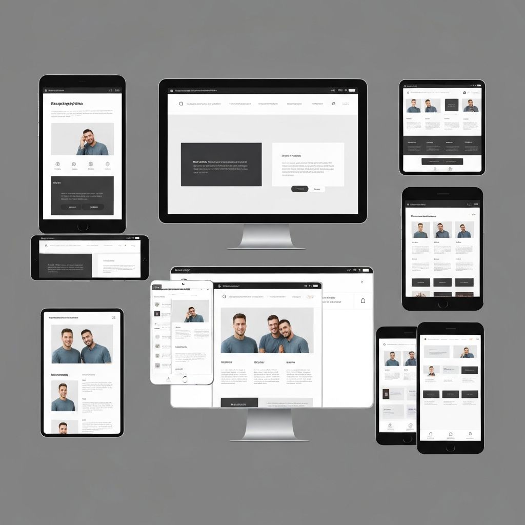
Responsive design is essential in today's multi-device world. Learn how to create adaptive interfaces with v0 that work flawlessly across all screen sizes.
Mobile-First Approach
Start with mobile design and progressively enhance for larger screens. This ensures optimal performance and user experience on all devices.
Base Mobile Styles:
```tsx
// Start with mobile-optimized defaults
<div className="p-4 text-sm">
<h1 className="text-2xl font-bold mb-4">Mobile First</h1>
<p className="leading-relaxed">Content optimized for mobile</p>
</div>
```
Progressive Enhancement:
```tsx
// Add tablet and desktop enhancements
<div className="p-4 md:p-6 lg:p-8 text-sm md:text-base">
<h1 className="text-2xl md:text-3xl lg:text-4xl font-bold mb-4">
Responsive Heading
</h1>
<p className="leading-relaxed max-w-prose">
Content that scales beautifully
</p>
</div>
```
Tailwind Breakpoints Mastery
Understanding and using Tailwind's responsive utilities effectively:
Breakpoint System:
- sm: 640px - Small tablets and large phones
- md: 768px - Tablets
- lg: 1024px - Laptops and small desktops
- xl: 1280px - Desktops
- 2xl: 1536px - Large desktops
Practical Example:
```tsx
<nav className="
flex flex-col sm:flex-row
gap-2 sm:gap-4 lg:gap-6
p-4 sm:p-6 lg:p-8
">
<a className="text-sm sm:text-base lg:text-lg">Home</a>
<a className="text-sm sm:text-base lg:text-lg">About</a>
<a className="text-sm sm:text-base lg:text-lg">Contact</a>
</nav>
```
Flexible Layout Patterns
Responsive Grid:
```tsx
<div className="
grid grid-cols-1 sm:grid-cols-2 lg:grid-cols-3 xl:grid-cols-4
gap-4 md:gap-6 lg:gap-8
">
{items.map(item => (
<Card key={item.id} className="h-full" />
))}
</div>
```
Adaptive Sidebar:
```tsx
<div className="flex flex-col lg:flex-row gap-6">
{/* Sidebar: full width on mobile, fixed width on desktop */}
<aside className="w-full lg:w-64 lg:flex-shrink-0">
<Navigation />
</aside>
{/* Main content: flexible */}
<main className="flex-1 min-w-0">
<Content />
</main>
</div>
```
Container Queries (Modern Approach):
```tsx
<div className="@container">
<div className="@sm:flex @md:grid @md:grid-cols-2">
{/* Component responds to container size, not viewport */}
</div>
</div>
```
Typography Scaling
Implement fluid, responsive typography that maintains readability:
```tsx
// Fluid typography with clamp
<h1 className="text-[clamp(2rem,5vw,4rem)] font-bold">
Fluid Heading
</h1>
// Responsive line heights
<p className="
text-sm sm:text-base lg:text-lg
leading-relaxed sm:leading-loose
max-w-prose
">
Readable content with appropriate line height
</p>
```
Touch-Friendly Interfaces
Design for touch interactions on mobile devices:
Minimum Touch Targets:
```tsx
// Ensure 44x44px minimum touch target
<button className="
min-h-[44px] min-w-[44px]
px-4 py-2
text-base
rounded-lg
">
Touch Friendly
</button>
```
Mobile Navigation:
```tsx
// Hamburger menu for mobile, full nav for desktop
<nav className="lg:hidden">
<MobileMenu />
</nav>
<nav className="hidden lg:flex gap-6">
<DesktopNav />
</nav>
```
Testing Responsiveness
Browser DevTools:
- Use responsive design mode
- Test all breakpoints
- Check touch interactions
Real Device Testing:
- Test on actual phones and tablets
- Check different orientations
- Verify touch gestures work
Automated Testing:
```typescript
// Playwright responsive tests
test('responsive layout', async ({ page }) => {
await page.setViewportSize({ width: 375, height: 667 });
// Test mobile layout
await page.setViewportSize({ width: 1920, height: 1080 });
// Test desktop layout
});
```
Performance Considerations
Responsive Images:
```tsx
import Image from 'next/image'
<Image
src="/hero.jpg"
alt="Hero"
width={1200}
height={600}
sizes="(max-width: 768px) 100vw, (max-width: 1200px) 50vw, 33vw"
priority
/>
```
Conditional Loading:
```tsx
'use client'
import { useMediaQuery } from '@/hooks/use-media-query'
export function ResponsiveComponent() {
const isMobile = useMediaQuery('(max-width: 768px)')
return isMobile ? <MobileView /> : <DesktopView />
}
```
Responsive design ensures your v0 application delivers an exceptional experience on every device, from smartphones to large desktop monitors.
Need Help with Your v0 Project?
Our team of v0 experts is ready to help you build amazing applications with cutting-edge AI technology.
Get in Touch