Building Accessible Applications with v0
Ensure your v0 applications are usable by everyone with proper accessibility practices.
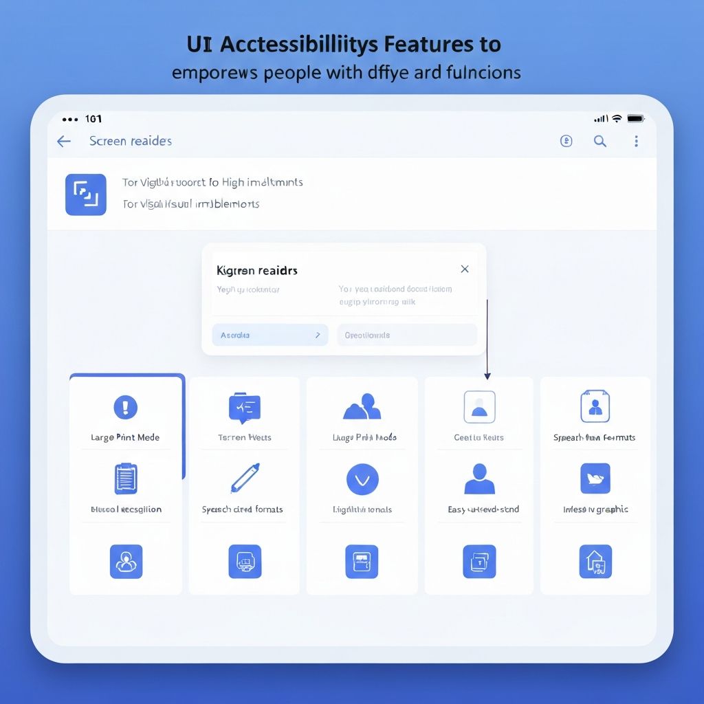
Accessibility is not optional—it's a fundamental requirement for modern web applications. Learn how to build inclusive applications that work for everyone.
Why Accessibility Matters
Over 1 billion people worldwide live with disabilities. Accessible design benefits everyone, improves SEO, reduces legal risk, and expands your user base significantly.
WCAG Guidelines Overview
Follow Web Content Accessibility Guidelines (WCAG 2.1) with four core principles:
- Perceivable: Information must be presentable to users in ways they can perceive
- Operable: Interface components must be operable by all users
- Understandable: Information and operation must be understandable
- Robust: Content must work with current and future technologies
Target WCAG 2.1 Level AA compliance as the industry standard.
Semantic HTML Implementation
Use proper HTML elements for better screen reader support:
```tsx
// Good semantic structure
<nav aria-label="Main navigation">
<ul>
<li><a href="/">Home</a></li>
<li><a href="/about">About</a></li>
</ul>
</nav>
<main>
<article>
<h1>Page Title</h1>
<p>Content goes here</p>
</article>
<aside aria-label="Related links">
<h2>Related Content</h2>
<ul>...</ul>
</aside>
</main>
<footer>
<p>© 2025 Company Name</p>
</footer>
```
Key semantic elements: `<header>`, `<nav>`, `<main>`, `<article>`, `<aside>`, `<footer>`, `<section>`.
Keyboard Navigation
Ensure complete keyboard accessibility:
```tsx
'use client'
import { useEffect, useRef } from 'react'
export default function AccessibleModal({ isOpen, onClose, children }) {
const modalRef = useRef<HTMLDivElement>(null)
const previousFocusRef = useRef<HTMLElement | null>(null)
useEffect(() => {
if (isOpen) {
// Store current focus
previousFocusRef.current = document.activeElement as HTMLElement
// Focus first focusable element in modal
const firstFocusable = modalRef.current?.querySelector(
'button, [href], input, select, textarea, [tabindex]:not([tabindex="-1"])'
) as HTMLElement
firstFocusable?.focus()
// Trap focus within modal
const handleKeyDown = (e: KeyboardEvent) => {
if (e.key === 'Escape') {
onClose()
}
if (e.key === 'Tab') {
const focusableElements = modalRef.current?.querySelectorAll(
'button, [href], input, select, textarea, [tabindex]:not([tabindex="-1"])'
)
const firstElement = focusableElements?.[0] as HTMLElement
const lastElement = focusableElements?.[focusableElements.length - 1] as HTMLElement
if (e.shiftKey && document.activeElement === firstElement) {
e.preventDefault()
lastElement?.focus()
} else if (!e.shiftKey && document.activeElement === lastElement) {
e.preventDefault()
firstElement?.focus()
}
}
}
document.addEventListener('keydown', handleKeyDown)
return () => document.removeEventListener('keydown', handleKeyDown)
} else {
// Restore focus when modal closes
previousFocusRef.current?.focus()
}
}, [isOpen, onClose])
if (!isOpen) return null
return (
<div
ref={modalRef}
role="dialog"
aria-modal="true"
aria-labelledby="modal-title"
className="fixed inset-0 z-50 flex items-center justify-center bg-black/50"
>
<div className="bg-white rounded-lg p-6 max-w-md">
{children}
</div>
</div>
)
}
```
Implement skip links for quick navigation:
```tsx
<a href="#main-content" className="sr-only focus:not-sr-only focus:absolute focus:top-4 focus:left-4 focus:z-50 focus:px-4 focus:py-2 focus:bg-blue-600 focus:text-white">
Skip to main content
</a>
```
Screen Reader Optimization
Provide clear ARIA labels and live regions:
```tsx
// Form with proper labeling
<form>
<label htmlFor="email">
Email Address
<span aria-label="required">*</span>
</label>
<input
id="email"
type="email"
aria-required="true"
aria-invalid={!!errors.name}
aria-describedby="email-error"
/>
<span id="email-error" role="alert" className="text-red-600">
{error && "Please enter a valid email"}
</span>
</form>
// Status updates
<div aria-live="polite" aria-atomic="true">
{message && <p>{message}</p>}
</div>
// Loading states
<button disabled={isLoading} aria-busy={isLoading}>
{isLoading ? 'Loading...' : 'Submit'}
</button>
```
Use descriptive alternative text:
```tsx
<img
src="/product.jpg"
alt="Blue cotton t-shirt with white logo, size medium"
/>
// Decorative images
<img src="/decoration.svg" alt="" role="presentation" />
```
Color and Contrast
Ensure sufficient color contrast ratios:
- Normal text (< 18pt): 4.5:1 contrast ratio
- Large text (≥ 18pt): 3:1 contrast ratio
- UI components: 3:1 contrast ratio
```tsx
// Good contrast examples
<button className="bg-blue-600 text-white"> {/* 8.6:1 ratio */}
Primary Action
</button>
<a className="text-blue-700 underline"> {/* 4.7:1 ratio */}
Learn more
</a>
// Don't rely only on color
<span className="text-red-600 font-bold underline">
Error: Required field
</span>
```
Testing Accessibility
Implement comprehensive testing:
```bash
# Install accessibility testing tools
npm install -D @axe-core/react jest-axe @testing-library/react
# Run automated tests
npm run test:a11y
```
```tsx
// Automated accessibility testing
import { render } from '@testing-library/react'
import { axe, toHaveNoViolations } from 'jest-axe'
expect.extend(toHaveNoViolations)
test('should not have accessibility violations', async () => {
const { container } = render(<MyComponent />)
const results = await axe(container)
expect(results).toHaveNoViolations()
})
```
Manual testing checklist:
- Navigate entire site using only keyboard
- Test with screen readers (NVDA, JAWS, VoiceOver)
- Zoom to 200% and verify layout
- Test with high contrast mode enabled
- Verify form validation messages are announced
Accessible Forms
Create fully accessible forms:
```tsx
'use client'
import { useState } from 'react'
export default function AccessibleForm() {
const [errors, setErrors] = useState<Record<string, string>>({})
return (
<form onSubmit={handleSubmit} noValidate>
<fieldset>
<legend>Personal Information</legend>
<div>
<label htmlFor="name">
Full Name <span aria-label="required">*</span>
</label>
<input
id="name"
type="text"
required
aria-required="true"
aria-invalid={!!errors.name}
aria-describedby="name-error"
/>
{errors.name && (
<span id="name-error" role="alert" className="text-red-600">
{errors.name}
</span>
)}
</div>
<div>
<label htmlFor="email">
Email Address <span aria-label="required">*</span>
</label>
<input
id="email"
type="email"
required
aria-required="true"
aria-describedby="email-hint email-error"
/>
<span id="email-hint" className="text-sm text-gray-600">
We'll never share your email
</span>
{errors.email && (
<span id="email-error" role="alert" className="text-red-600">
{errors.email}
</span>
)}
</div>
</fieldset>
<button type="submit">Submit Form</button>
</form>
)
}
```
Common v0 Accessibility Patterns
Accessible modal dialogs, tooltips, dropdown menus, and tabs:
```tsx
// Accessible tooltip
<button
aria-describedby="tooltip"
onMouseEnter={() => setShowTooltip(true)}
onFocus={() => setShowTooltip(true)}
>
Help
</button>
{showTooltip && (
<div id="tooltip" role="tooltip">
Additional information
</div>
)}
```
Building accessible applications ensures everyone can use your product and significantly improves overall user experience.
Need Help with Your v0 Project?
Our team of v0 experts is ready to help you build amazing applications with cutting-edge AI technology.
Get in Touch